But don’t lose hope! There are steps you can take to make a resume that will distinguish you from the crowd while still remaining professional and practical. If you’re not confident in your design chops, there are a number of sites that offer resume templates. But the more personalized you make your resume, the better. This article will walk you through 7 creative resume design layouts that will set you apart from other applicants. A word of caution: the type of design layout you use for your resume should depend on the kind of company you are applying for. Research the company to try and get a sense of their values and company culture before applying. It’s a good idea to also have a traditional resume on hand for cases where a company probably wouldn’t be receptive to an outside-the-box resume. When you’re not certain if you should use your creatively designed resume, submit a traditional resume and bring your creative resume to the interview as an example of what you can do.
1. Classic Layout With a Twist
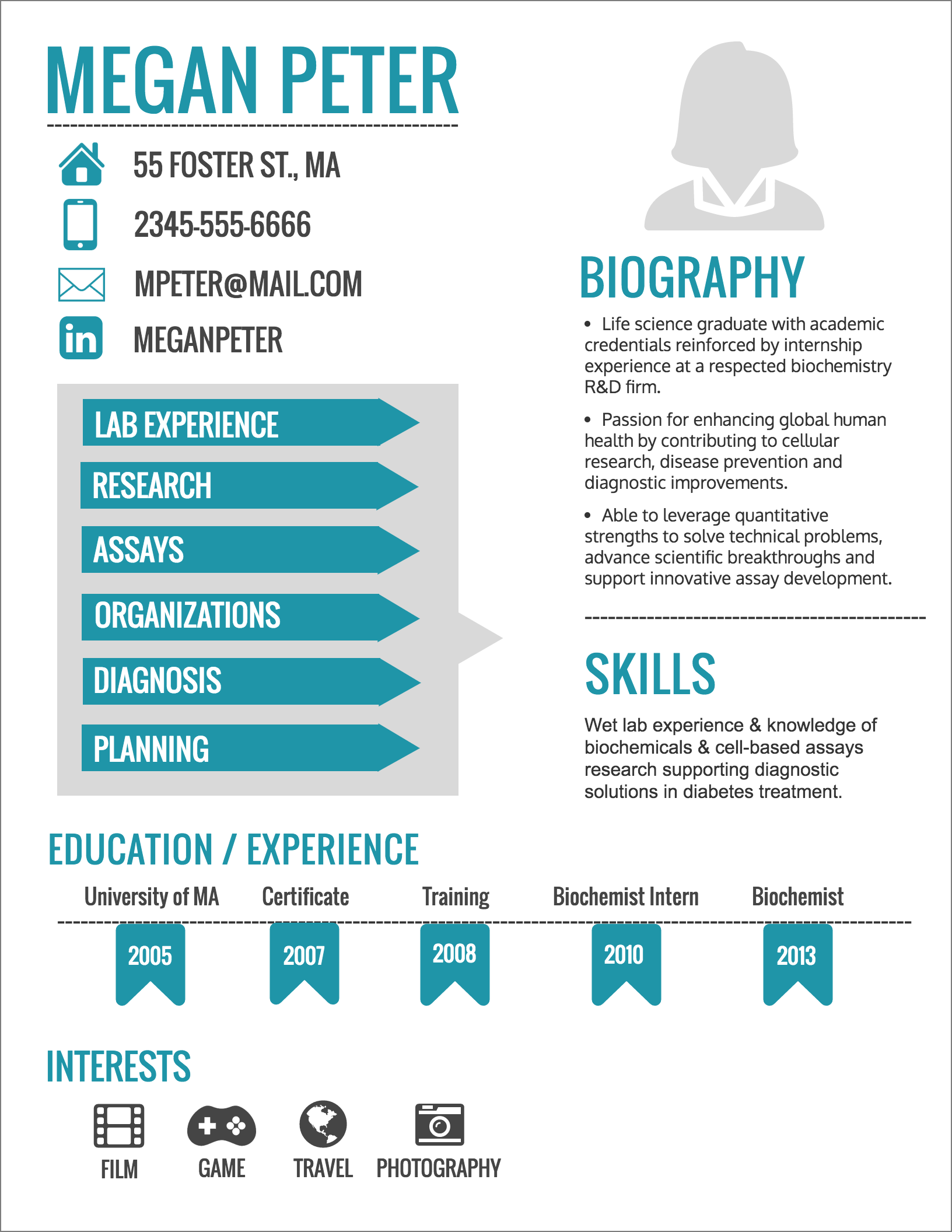
You might be a bit nervous about making a resume that’s too out there and outside of the box. That’s OK. The fact is, some companies won’t be as receptive to unusual, outside of the box resumes. But that doesn’t mean your resume have to be just like everybody else’s – you can use small design embellishments to give your resume a little something different while still maintaining a classic, simple layout. For example, you can use pictograms to illustrate things like skill level, interests, social media accounts, or anything that can be represented by an icon.You can also add some flare to a traditional resume by using colours and different fonts as accents. A pop of colour will make your resume more visually interesting without distracting from the bare-bone information. This will make your resume more visually interesting than a traditional resume, while still maintaining the tried resume format.
2. Timeline Layout
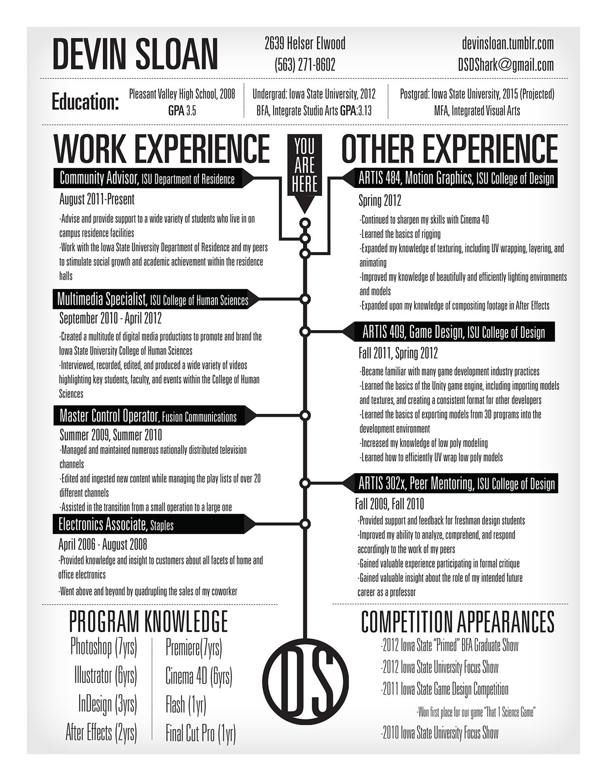
If you want to highlight your professional journey in your resume, a timeline is an effective layout. The easiest way to do this is to map your work experience in chronological order from left to right or from the top to the bottom of the page. The example below resembles a traditional resume, but uses a timeline as a way to organize and connect each section.
But you could also get more even more creative and use your timeline resume to tell a story, like this freelance designer did in her resume.
3. Picture Perfect Layout
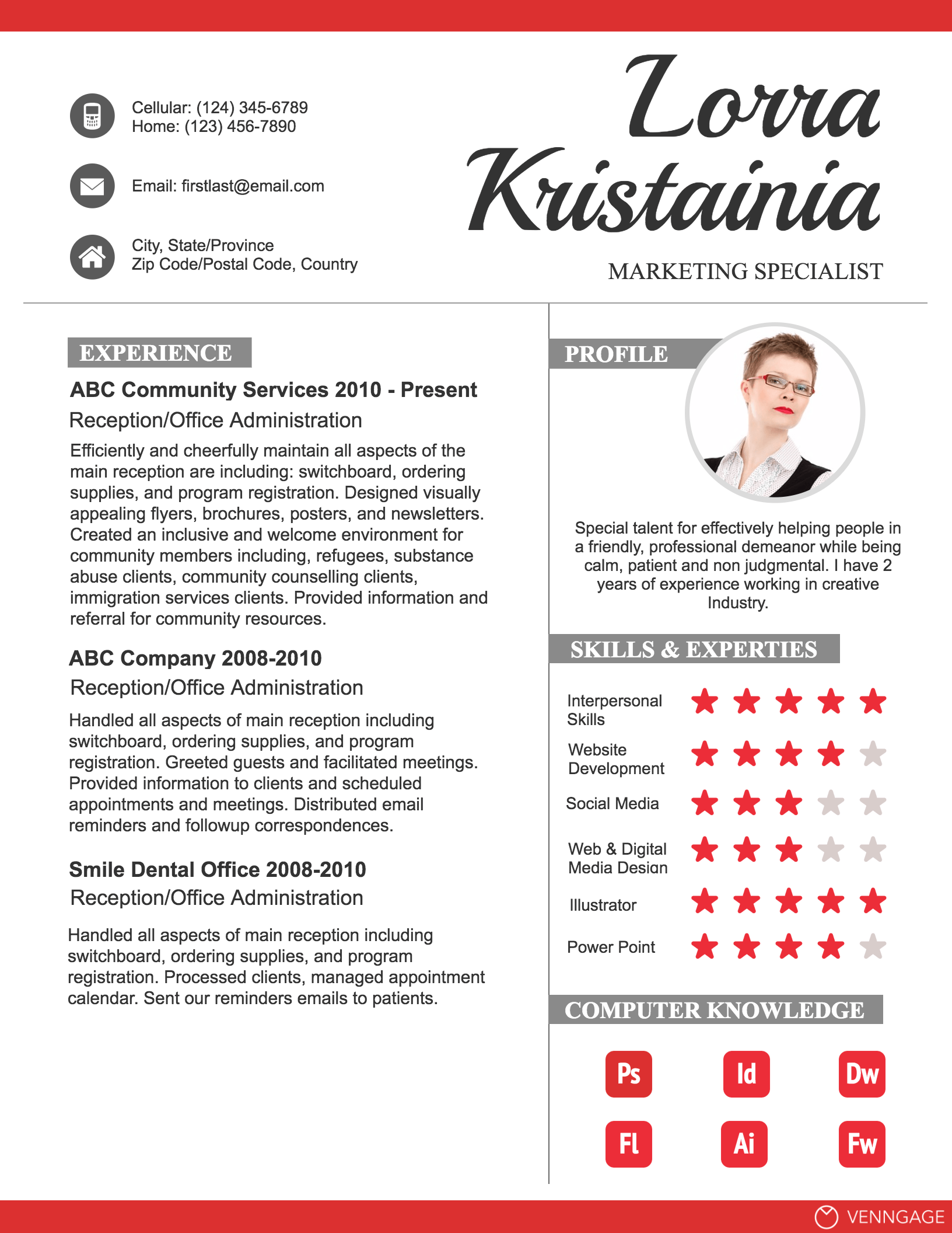
The rule of thumb used to be that you shouldn’t include a photo on your resume. But with more focus being given to visual content and with the prominence of social media, attitudes towards photos on resumes seems to be changing. After all even if you don’t include a photo on your resume, employers can easily search for your social media profiles to see what you look like. And if the photo you include in your resume reflects the culture of the company you are applying for, you will seem like a better fit for their team. Think about it: how many people tell you that they suck at remembering names? But faces are easier to remember. Include a photograph in your resume to make your resume more memorable than the hundreds of other applications that are only words. Make sure the picture you use isn’t so big or high resolution that it makes your resume file huge. If your file is too big, employers will get frustrated when they try to download it. Take the employer’s convenience into consideration. If including a photograph on your resume is still feels like too much, provide the links for your Twitter, Linked In, and Facebook.
4. Map Layout
If you’ve worked in a number of remote and exciting locations, or if the work you have done has impacted people in different locations, a map chart can be a fun and effective way to visualize that. The map chart can act as a visual embellishment for your Experience section. The example below uses a map to show where the applicant has lived and worked, without taking too much attention away from the rest of her resume.
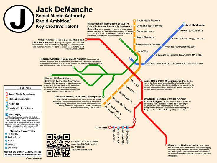
You could also take the same route as this person and design your resume to resemble a map itself, to signify the route your career has taken/the route you would like it to take moving forward. A layout like this is a lot more complicated and time consuming to design, though.
5. Graphs and Charts Layout
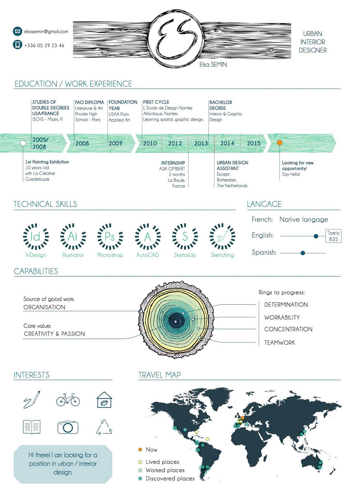
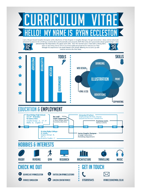
If you don’t want to make the focus of your resume a single chart, you can still use charts and graphs to visualize certain key achievements. For example, if your work in a past position drove a notable increase in sales for the company, you could visualize the increase using a line chart. You could also use a bar graph to show your skill level in certain programs. A word to the wise: keep your charts simple and make sure you select the right type of chart for the information you are communicating. A poorly made chart will only confuse readers – the opposite of what you want on your resume! Take the CV below, which uses a combination of different charts and icons to communicate the applicant’s experience.
6. Sectional Layout
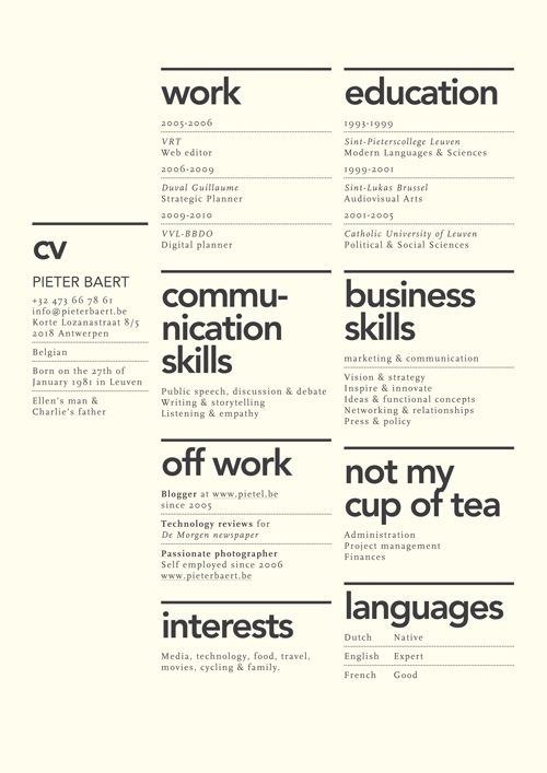
This is a simple way to reimagine a traditional resume layout. Rather than following a traditional top-to-bottom design, you can organize your resume into sections using borders or blocks of color. The example below shows how some simple lines can create a beautiful and minimalist sectional resume layout.
7. Slideshow Resume
Many workplaces want their employees to be fluent in multimedia tech. You can showcase your multimedia creation skills by creating a slideshow presentation. A presentation offers you the opportunity to use lots of visuals and a storytelling structure to introduce yourself. For an example, check out this man‘s short but sweet resume slideshow. A note: this kind of resume should generally be offered as an accompaniment to a traditional resume, in case the employers has difficulty loading or downloading you multimedia file. Whatever You Do, Do it Well! This is the most important point: whatever resume design layout you decide to use, make sure you use it well. This means that your resume must be free of surface errors like text misalignment, weird spacing, chartjunk, or any other formatting issues. You also need to make sure that you don’t neglect essential information for the sake of a cool design. Your previous places of employment, contact information, and list of skills should all be easy to read and understand. Remember, your resume is the very first impression prospective employers will have of you – so make it count! Featured photo credit: Unsplash via unsplash.com
